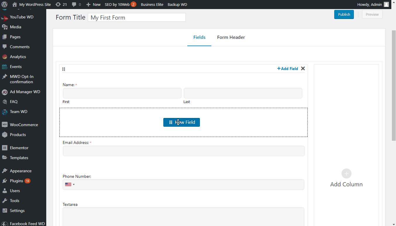
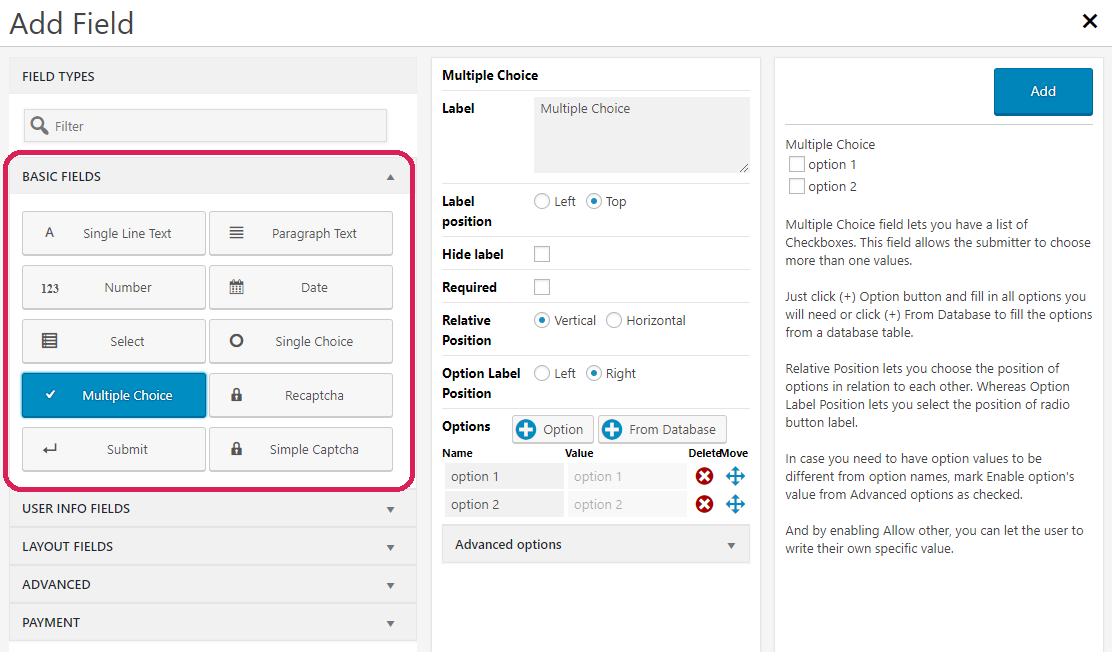
WordPress Form Maker plugin provides a variety of useful and multi-functional fields. We will discuss each field and its options in this section. To start adding fields to your form, drag the New Field button and drop it to the necessary area of the form content.
This field set allows you to place common fields for online questionnaires, such as text, name or email input, text box and more. Click on buttons indicating each field to configure them and add them to your form.

Single Line Text
This field adds a regular text input to your form, letting users write any short text. It accepts letters, numbers and special characters.
Paragraph Text
To place a text box to your form and allow users to enter large text, use Paragraph Text field. This field is handy in case you wish to allow the submitter to provide a motivation letter. Users can write letters, numbers, special characters and line breaks in this field.
You can change the dimensions of Paragraph Text field with its Size(px) setting.
In it's advanced settings, set character limitations, allow unique values, and set additional attributes.
Number
This is an input text with number validation. Users can write an integer number directly, or use the spinner arrows to specify it. Number field has the following unique options.
- Step. Defines the number to increment/decrement the spinner value when the users press up or down arrows.
- Min Value. Sets a lower limit for the value of your Number field.
- Max Value. Sets an upper limit for the value of your Number field.
Date
Date field allows you to have a date field on your form, and let users pick a date by scrolling through years and months. You can fully customize it with the following options.
- Date format. Specify the format of your date field, e.g. mm/dd/yy. The guide to configure a specific date format is provided on the right side of Date field toolbox.
- First day of the week. Select the weekday to be the first day of the week on date picker calendar.
- Default date. Specify a default value for your date field.
- Minimum date. Set the minimum date, which users can provide when specifying a date.
- Maximum date. Set the maximum date, which submitter can select when specifying a date.
- Dates to exclude. You can provide certain date values, which users will not be allowed to select.
- Selectable Week Days. Specify all weekdays, which you wish to allow users to select.
- Show date picker (Advanced options). Mark this option as checked if you wish to add a date picker button to your date field.
Select
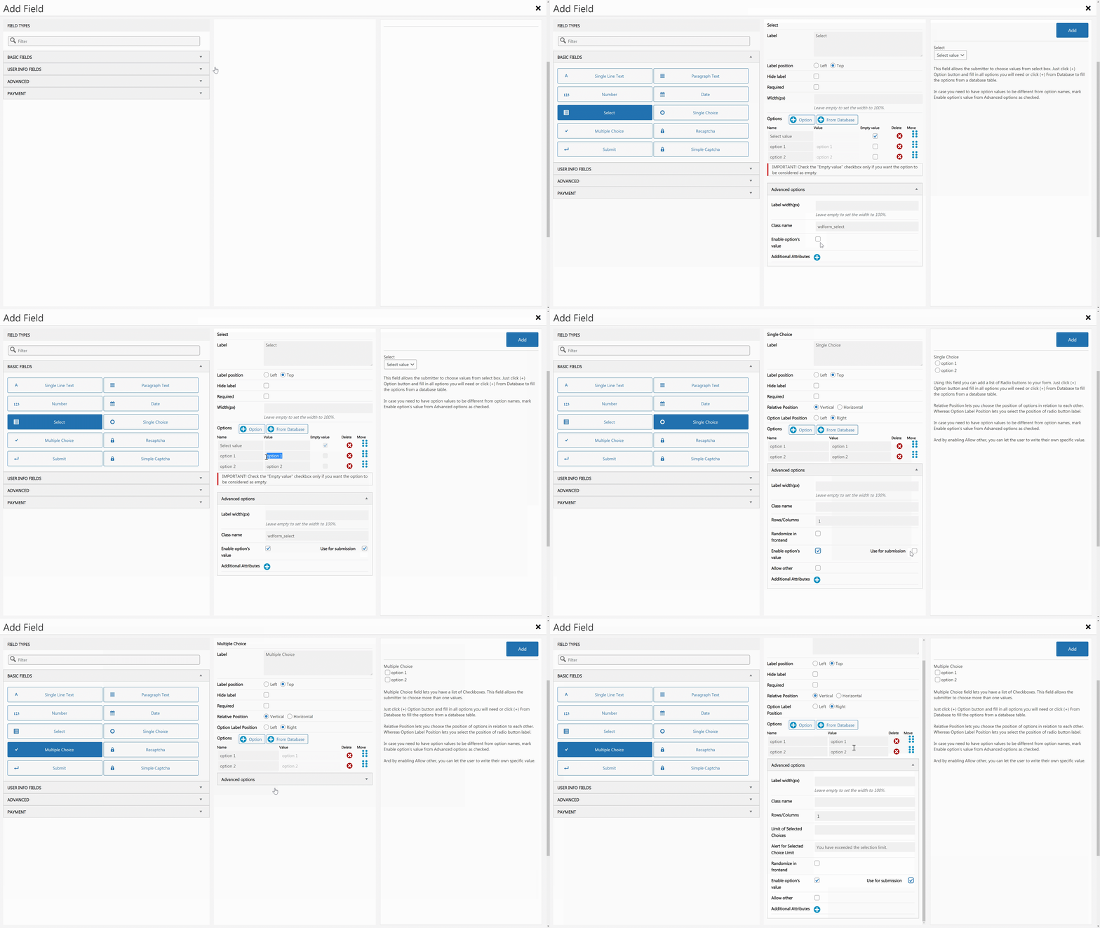
This field of Form Maker plugin allows the submitter to choose values from the select box field. It lets you add unlimited options to your select box using Options section of Select field toolbox. Just click (+) Option button and fill in all options you will need.
Mark Empty Value checkbox next to the option, which is going to be set as the default value of your Select box field.
In the Advanced settings of the Select field, you have the option to show the value on your form.
Single Choice
You can add a radio field to your form using Form Maker’s Single Choice field. It lets you have unlimited options, but allow users to pick only one of them.
In the Advanced settings of the Single Choice field, you have the option to show the value on your form.
Multiple Choice
As in Single Choice, Form Maker’s Multiple Choice field lets you have a list of options which users can select. However, this field will allow users to choose more than one values. You can also limit the number of chosen values from the advanced settings.
Single and Multiple Choice fields have the following unique settings:
- Label position. Set the position of the field label. It can be set to Left or Top.
- Relative Position. Choose the position of options in relation to each other. They can appear in Vertical or Horizontal views.
- Option Label Position. Select the position of the checkbox/radio button label, which can be Left or Right.
- Rows/Columns (Advanced Options). Specify the number of rows/columns for your Single or Multiple Choice fields.
- Randomize in frontend (Advanced Options). Activate this setting, in case you need the checkboxes/radio buttons to appear in random order each time users load the form.
- Allow other (Advanced Options). If enabled, this setting adds Other option to the list of items in your Single or Multiple Choice fields. Selecting Other lets users to write their own value.
In the Advanced settings of the Multiple Choice field, you have the option to show the value on your form.

Google reCAPTCHA
Form Maker is integrated with Google reCAPTCHA, which protects your forms from spambots. You can place the following two types of ReCaptcha verification to your forms:
- reCAPTCHA V2, which let you verify non-robot users with “I’m not a robot” checkbox.
- Invisible reCAPTCHA, which validates users in the background, without requiring user interaction.
Invisible reCAPTCHA is the newest type of user verification provided by Google. With Form Maker plugin, you can add it to your form and display it with the following ways:
- Invisible,
- Inline,
- Bottom-Right,
- Bottom-Left.
To place Google reCAPTCHA or Invisible reCAPTCHA on your form, you need to get Site Key and Secret Key by registering your website on Google reCAPTCHA website.
After registering and creating the keys, copy them to Form Maker > Options page.
Submit
This is the submit button field which can be added your form unlimited times. It validates all form field values, saves them on MySQL database of your website, sends emails and performs other actions configured in Form Options.
Reset button can be added along with Submit. It lets the user clear all inserted values when filling out the form.
Simple Captcha
You can use this field as an additional word verification option against spambots. It is a random combination of numbers and letters, and users need to type them correctly to submit the form. Set the number of symbols using Digits (3 - 9) option.